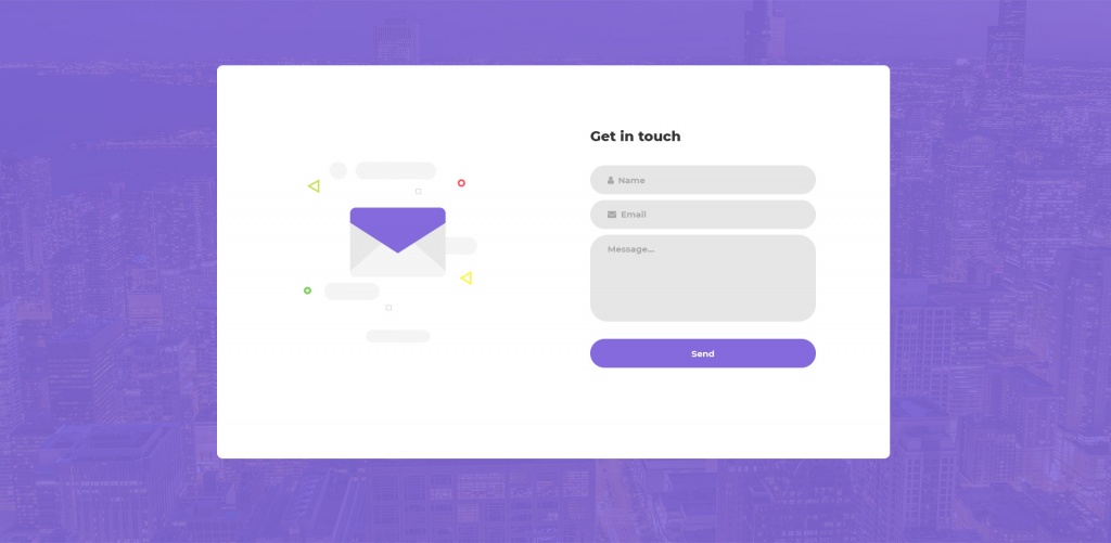
Okay, someone with a need has found you and your company’s website. The person is interested in your services and wants to know more. You have just created a new e-book on the subject. But how do you get the person to leave his e-mail address?
So you get to know who the person is? In other words, how do you design a frictionless and good form that causes the recipient to act.

Contact form that converts
The e-mail address is the new era’s hard currency. Once you get it, you suddenly have an interesting lead in your CRM system that is ready to be processed by any means. With a properly designed form, chances are significantly greater that your visitors convert, either make a purchase, sign up for a newsletter, sign up for an event or download an ebook. Here are ten things to consider when creating your forms that improve your micro conversions.
1. Use arrows and direction indicators
A great way to show your visitor where you want him or her to target is by using different types of classic arrows. Capture an image, movie or other visual element, and then direct the visitor with an arrow to the form.
2. Help on the way
Please provide explanatory and clarifying information along the way when the visitor completes the form. All to avoid mistakes and misunderstandings that leave the visitor. Show how you want the phone number, describe how to enter zip codes, etc. It will also make it easier for you to use the information in your own systems – if they are the ones you want them from the beginning.
3. Use clear contrasts
To get your form on the page, please use different colours, shapes or objects. In this way, you pull the visitor’s eyes in the right direction and help them convert.
4. Enter what is mandatory
If it is necessary for the visitor to fill in a field, you should state it clearly from the beginning. It’s good to use asterisks, but then you need to describe it because it’s a compulsory field so it’s not possible to miss.
5. Get your conversion button to stand out
Whether it says “download”, “report” or “send” it is important to have a button that the visitor can not miss. Use a colour, preferably a signal colour as orange, so that the button is out of the rest of the form. Design it as a button, make it as big as possible and show with the arrows where it is located.
6. Limit the number of fields
The sooner you can fill out a form the better. Statistics show that by reducing the number of fields from six to three, you can increase your conversion by over 50 percent. Just ask what you really need in the first step.
7. Use progressive profiling
Using the right marketing automation system, you can easily fill in more information about your visitor when they’ve left their email address. Next time the visitor is in and want to download or sign up for something, you may ask for some new things that you do not yet know. But still stay in three to four fields.
8. Ask for the right things
Make sure you get the right information depending on what the visitor is looking for. If it’s an order, you may need billing address and email address. If you want your salespeople to follow up on your visit, you might need a phone number. If you have a large geographical spread, you may need to know where the visitor is living.
9. Do not forget mobile users
More and more visitors find you via mobile so it’s important to customise the form for the most common formats. Add the fields vertically rather than horizontally. Skip unimportant fields. Make the conversion button big and thumb-friendly. Avoid drop-down if possible.
10. Test yourself
Testing is an important part of your form strategy to optimise your conversions. Use a simple A / B test where you make a small change between different editions. In this way you can check everything from length, number of fields, location, colour to buttons, fonts, sizes and texts. The more traffic you have the faster you can change, but in order to determine what is best, you should have at least 1-200 conversions.


